Image Optimization
The theme optimizes images by default with a custom Hugo’s markdown render hook:
- The theme creates resized versions for each image, ranging from 100 to 700 pixels wide.
- It generates WebP versions for each size if the original image format isn’t WebP.
- The theme keeps the original file format as a fallback for browsers that don’t support the WebP format.
- Images in SVG format are embedded as-is.
Blog Post Cover Images
Use the front matter of your posts to add cover images:
---
cover:
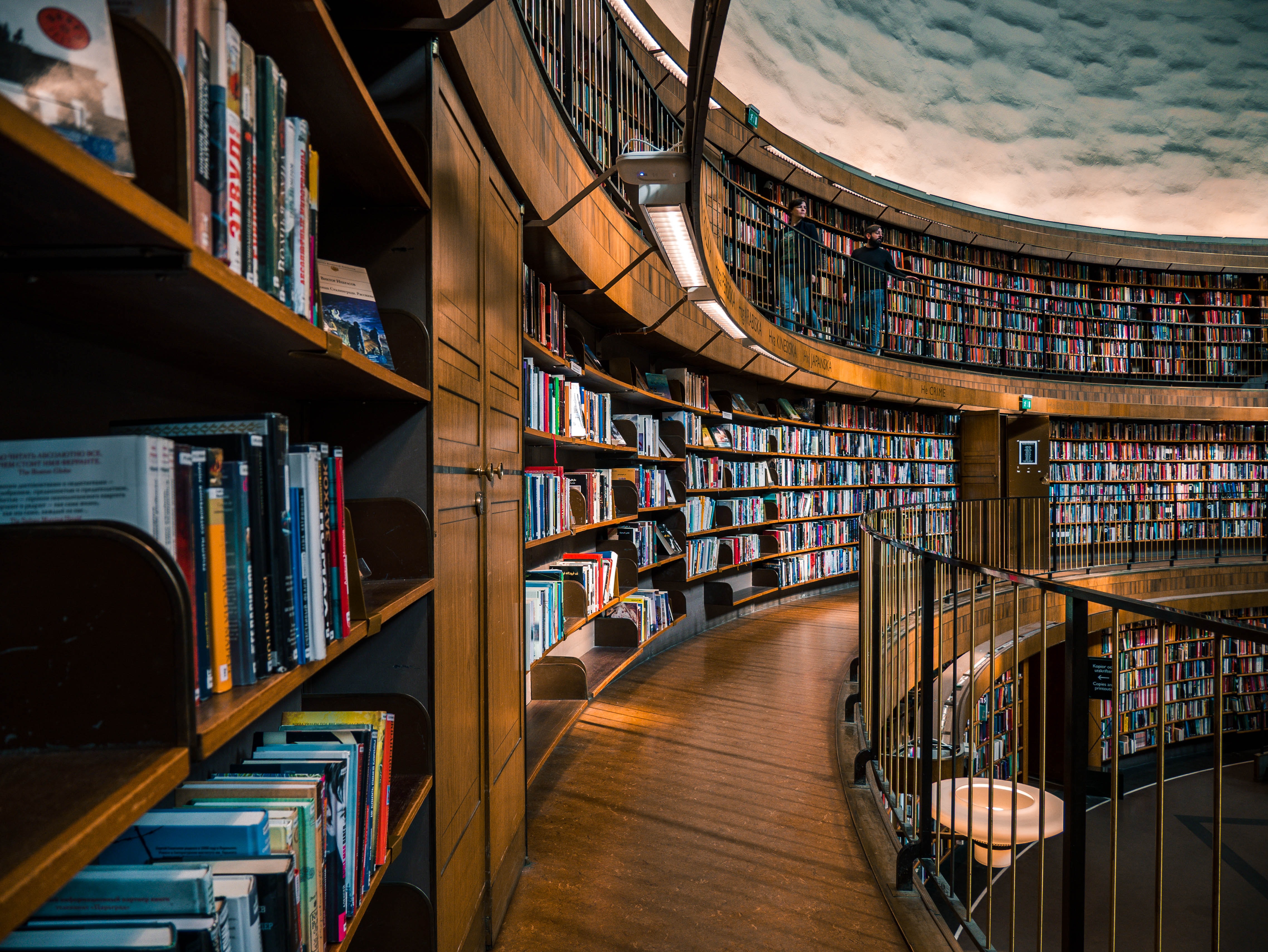
  src: alexandre-van-thuan-mr9FouttLGY-unsplash.jpg
  alt:
    The interior of Stadsbiblioteket in Stockholm - Gunnar Asplunds library from
    1928. The architecture is a transition between neoclassicism and
    functionalism.
  caption: By [Alexandre Van Thuan](https://unsplash.com/photos/mr9FouttLGY)
---
Captions
Add captions to your inline images like this:
---

---

JPEG and WebP Quality
The default quality is 75%. See the
official Image Processing Config Hugo docs.
Change it by adding the following to the hugo.toml file:
[imaging]
  quality = 75
Resizing
By default, the theme creates resized versions of images ranging from 300 to 700
pixels wide in increments of 100 pixels. Override the resize behavior by adding
the following to the hugo.toml file:
[params]
  [params.imageResize]
    min = 300
    max = 700
    increment = 100
Lazy Loading
Images are lazily loaded by default using the loading="lazy" attribute on HTML
img tags.
